Jekyll2023-04-28T13:24:40+02:00https://pixelambacht.nl/feed.xmlPixelambachtBoiled down: fixing the variable font inheritance problem2022-09-07T02:00:00+02:002022-09-07T02:00:00+02:00https://pixelambacht.nl/2022/boiled-down-fixing-variable-font-inheritanceBoth font-feature-settings and font-variation-settings take a list of font properties. The caveat is that every property you don’t set will be set to it’s default value. This makes it hard to change one setting without unsetting the rest. But luckily CSS variables can be used to fix this problem!
In the following example the weight will be set to 100 and the width to 50%, resulting in “Hello world” being rendered in a narrow bold style:
<style>.a{font-variation-settings:"wdth"50,"wght"700;}</style><divclass="a">
Hello world
</div>
But in this case “Hello world” will be rendered in a narrow regular style:
<style>.a{font-variation-settings:"wght"700;}.b{font-variation-settings:"wdth"50;}</style><divclass="a"><divclass="b">
Hello world
</div></div>
The reason is that class b will overwrite everything set in class a. The browser doesn’t say “the weight was set to 700 earlier, so I’ll just inherit that”. It says, “weight is not set, so I’ll use the default value of 400”.
To prevent this you can use CSS variables to keep track of each value, as they will cascade down nicely:
<style>.a,.b{/* Default values */--wght:400;--wdth:100;font-variation-settings:"wght"var(--wght),"wdth"var(--wdth);}.a{/* Override just the "wght" */--wght:700;}.b{/* Overwrite just the "wdth" */--wdth:50;}</style><divclass="a"><divclass="b">
Hello world
</div></div>
Now “Hello world” will be rendered in a narrow bold style, like you’d expect. Every change in a CSS variable’s value will trickle down and be used whenever font-variation-settings gets applied.
Note that you normally don’t need to use font-feature-settings or font-variation-settings. In our example you should use font-weight and font-stretch instead of manipulating the axes directly. Most OpenType features can be set through font-variant. If you do need access to low level features (for animations, specimen sites, custom axes, etc.), using CSS variables is a good way to fix the inheritance problem.
]]>Optical size, the hidden superpower of variable fonts2021-06-17T02:00:00+02:002021-06-17T02:00:00+02:00https://pixelambacht.nl/2021/optical-size-hidden-superpowerVariable fonts have a hidden superpower that just not enough people are raving about. This feature will make letters actually change the way they look when shown in small or large sizes. It all happens automatically in the browser. All you need is a variable font with an optical size axis!
But first: why do we need different designs for different sizes?
When a graphical element needs to be bigger, you can basically do two things: scale it up, or redraw it. Scaling is the simplest solution, but doesn’t always look right. Take this mushroom from a fictional videogame. Here it is drawn at 8×8 pixels, the original size it appears in the game:
Cute! But now the player shoots ultrasonic ninjalasers at the mushroom, which makes it grow three times as big. We could simply scale up our mushroom:
But this doesn’t look quite right. We have more canvas to work with, so let’s use it to add detail and refine the design:
The mushroom design adjusts to its size: it gains detail when it gets bigger. This makes sure the design works at small sizes, and at large sizes:
This principle doesn’t only work for videogame mushrooms. It works for typography too!
Why isn’t scaling good enough for fonts?
Fonts are vector graphics and they’ll keep looking good when scaled up. This is true — but the level of detail remains the same at all sizes. This means a design meant for small sizes can look chunky and crude at large sizes. Or a design meant for large sizes can look convoluted and finicky at small sizes.
Size-specific design has been around for a long time in typography. Nick Sherman wrote about this before:
The idea of modifying a typeface’s letterforms for different situations is nothing new. As far back as Gutenberg, each size of a letterpress typeface has traditionally featured “optical size” variations that altered the spacing, proportions, weight, and other details for optimal results. This concept has been applied to some digital typefaces that are offered as “Text” and “Display” versions, for example.
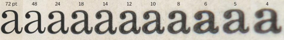
This is illustrated in this image of the letter a in the Century Expanded typeface. Each a is printed at a different size and then scaled so you can see the change in detail:
"Each size of Century Expanded as it existed in analog metal form had design variations to maintain stylistic traits at different sizes, compensate for technical printing issues, and improve readability."
If you want to recreate this for the web, you’d need 11 different font files of the same typeface, each one representing a specific optical size. Oof. That’s a lot of files.
So, enter variable fonts. If a variable font has an opsz axis, it means its design will change depending on the size it’s used at. Just like that! The browser and the font work this out completely automatically.
How does this look in practice?
For both Aparey and Fraunces we created a specimen site that showcase the difference between text with and without optical size:
Fraunces with appropriate optical sizing on the left, without optical sizing on the right.
I found these differences quite dramatic when I first saw them, especially on the smaller text. YMMV on that, but hot dang — the text with optical sizing looks so much better!
Here’s a simple demo so you can look at how an individual letter changes. It’s using the Fraunces typeface. Edit the letter in the box to see how your favorite character changes its optical sizing!
The browser will apply the right optical size out of the box. If for some reason you want this turned off, you can use font-optical-sizing: none (auto is the default value). This will make all font sizes use the font’s default design.
If you want to control the optical size independent from the font size, you can set values for the opsz axis directly. Say a font has an optical size range from 16 to 64, you can set it to the maximum value like so: font-variation-settings: 'opsz' 64.
But unless you’re deliberately breaking typography and design rules, the font-size-to-optical-size thing the browser does should be your best option.
Go forth and picketh fonts with optical sizeths
A font with an optical size axis will make itself look better for the size it’s used at. It does so automatically, in collaboration with the browser or the operating system. You don’t have to do anything yourself — except use a font with an optical size axis!
Special megathanks to Luke Coe for letting me use his pixel mushroom. Go check out his other artwork!
In this Twitter thread I asked how to best explain what optical size is, and a lot of smart folks have given great examples. Check this out if you want to learn more.
]]>Wakamai Fondue on the command line: never write font CSS again!2021-02-11T01:00:00+01:002021-02-11T01:00:00+01:00https://pixelambacht.nl/2021/wakamai-fondue-command-lineDid you know? Wakamai Fondue is also command line tool! You can use it to generate all the CSS for all your fonts. No need to head over to the website, drag’n’drop your font, click the “Download stylesheet” button, save the file, and all that hassle. Just type wakamai-fondue -c MyFont.woff2 and the CSS will flood your terminal window! Bleep bloop!
Installing the fondue
Make sure you have npm running on your system. If you do any kind of modern browser computing, this is probably already the case. If not, head over here.
Install Wakamai Fondue from the terminal as follows:
$ npm -ginstall @wakamai-fondue/cli
This will make Wakamai Fondue globally available on your system!
Using the fondue
As a responsible citizen of cyberspace, you obviously want to take a minute and sit down comfortably to read the manual. This can be done with wakamai-fondue -h and it will tell you something like:
Usage: wakamai-fondue [options] <file>

Options:
  -V, --version  output the version number
  -c, --css      Generate CSS
  -j, --json     Dump info about font in JSON format
  -h, --help     display help for command
Great! With all this information injected into your brain hemispheres, it’s time to actually get some work done. Let’s feed it a font, for instance the variable font Recursive!
$ wakamai-fondue -c Recursive_VF_1.072.woff2
This will output all the CSS for your font directly to your terminal. If you’d rather save it to a file, you can do so by adding > filename.css:
You will now have a file on your computer called recursive.css and it will contain all the CSS you need to use the OpenType layout features and variable instances of the Recursive font.
What’s in the CSS?
The CSS is the same as the Wakamai Fondue site will produce. This is because the CLI tool uses the same “engine”. The Wakamai Fondue Engine is powered by the awesome LibFont library, and provides some more human friendly data based on the raw font data.
So let’s look at recursive.css and quickly go through what CSS is generated for you. The idea is that you keep whatever you need, and throw away whatcha don’t.
First up is the @font-face rule:
/**
* CSS for Recursive Sans Linear Light
* Generated by Wakamai Fondue - https://wakamaifondue.com
* by Roel Nieskens/PixelAmbacht - https://pixelambacht.nl
*/@font-face{font-family:"Recursive Sans Linear Light";src:url("Recursive_VF_1.072.woff2");font-weight:3001000;unicode-range:U+000D,U+0020-007E,U+00A0-017E,U+018F,U+0192,U+019D,U+01A0-01A1,U+01AF-01B0,U+01C4-01CC,U+01E6-01E7,U+01EA-01EB,U+01F1-01F3,U+01FA-021B,U+022A-022D,U+0230-0233,U+0237,U+0259,U+0272,U+02B9-02BC,U+02BE-02BF,U+02C6-02CC,U+02D8-02DD,U+0300-0304,U+0306-030C,U+030F,U+0311-0312,U+0315,U+031B,U+0323-0328,U+032E,U+0331,U+0335,U+03C0,U+0E3F,U+1E08-1E09,U+1E0C-1E0F,U+1E14-1E17,U+1E1C-1E1D,U+1E20-1E21,U+1E24-1E25,U+1E2A-1E2B,U+1E2E-1E2F,U+1E36-1E37,U+1E3A-1E3B,U+1E42-1E49,U+1E4C-1E53,U+1E5A-1E5B,U+1E5E-1E69,U+1E6C-1E6F,U+1E78-1E7B,U+1E80-1E85,U+1E8E-1E8F,U+1E92-1E93,U+1E97,U+1E9E,U+1EA0-1EF9,U+2007-200B,U+2010,U+2012-2015,U+2018-201A,U+201C-201E,U+2020-2022,U+2026,U+2030,U+2032-2033,U+2039-203A,U+203E,U+2044,U+2052,U+2070,U+2074-2079,U+2080-2089,U+20A1,U+20A6,U+20A8-20AD,U+20B1-20B2,U+20B4-20B5,U+20B8-20BA,U+20BC-20BD,U+20BF,U+2113,U+2116,U+2122,U+2126,U+212E,U+2153-2154,U+215B-215E,U+2190-2199,U+2202,U+2205-2206,U+220F,U+2211-2212,U+2215,U+2219-221A,U+221E,U+222B,U+2248,U+2260-2261,U+2264-2265,U+25A0-25A1,U+25B2-25B3,U+25B6-25B7,U+25BC-25BD,U+25C0-25C1,U+25C6-25C7,U+25CA,U+2610-2611,U+2661,U+2665,U+2713,U+27E8-27E9,U+E132-E133,U+F8FF,U+FB01,U+FB03;}
Make sure the src is correct. Wakamai Fondue currently doesn’t add the path, but there’s an issue for that.
You see that the font-weight range is set properly, so browsers will know how to use the variable weight axis and doesn’t go faux bold on you.
Next up is a massive unicode-range blob, matching exactly what the font supports. You can remove codes if you want a fallback font to take care of those characters, for instance because it has a more beautiful ampersand, or the preferred design for a specific language. Or you can safely remove this entire thing if you don’t have a need for it.
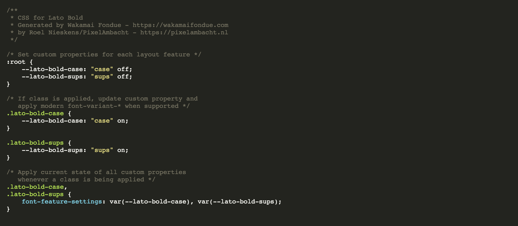
Now, on to the OpenType features. This uses the patented Wakamai Fondue Inheritance Problem Fixing Method™. That’s quite a mouthful, so you can just say “WFIPFM™” in casual conversation (the ™ is silent).
First we set CSS variables for all of Recursive’s features:
/* Set custom properties for each layout feature */:root{--recursive-sans-linear-light-aalt:"aalt"off;--recursive-sans-linear-light-afrc:"afrc"off;--recursive-sans-linear-light-case:"case"off;--recursive-sans-linear-light-dlig:"dlig"off;--recursive-sans-linear-light-dnom:"dnom"off;--recursive-sans-linear-light-frac:"frac"off;--recursive-sans-linear-light-numr:"numr"off;--recursive-sans-linear-light-ordn:"ordn"off;--recursive-sans-linear-light-pnum:"pnum"off;--recursive-sans-linear-light-sinf:"sinf"off;--recursive-sans-linear-light-ss01:"ss01"off;--recursive-sans-linear-light-ss02:"ss02"off;--recursive-sans-linear-light-ss03:"ss03"off;--recursive-sans-linear-light-ss04:"ss04"off;--recursive-sans-linear-light-ss05:"ss05"off;--recursive-sans-linear-light-ss06:"ss06"off;--recursive-sans-linear-light-ss07:"ss07"off;--recursive-sans-linear-light-ss08:"ss08"off;--recursive-sans-linear-light-ss09:"ss09"off;--recursive-sans-linear-light-ss10:"ss10"off;--recursive-sans-linear-light-ss11:"ss11"off;--recursive-sans-linear-light-ss12:"ss12"off;--recursive-sans-linear-light-ss20:"ss20"off;--recursive-sans-linear-light-sups:"sups"off;--recursive-sans-linear-light-titl:"titl"off;--recursive-sans-linear-light-zero:"zero"off;}
And then provide CSS to turn each feature on. For some features, we prefer the more modern CSS in an @supports rule. Here’s the (snipped) code:
/* If class is applied, update custom property and
apply modern font-variant-* when supported */.recursive-sans-linear-light-aalt{--recursive-sans-linear-light-aalt:"aalt"on;}.recursive-sans-linear-light-afrc{--recursive-sans-linear-light-afrc:"afrc"on;}@supports(font-variant-numeric:stacked-fractions){.recursive-sans-linear-light-afrc{--recursive-sans-linear-light-afrc:"____";font-variant-numeric:stacked-fractions;}}.recursive-sans-linear-light-case{--recursive-sans-linear-light-case:"case"on;}.recursive-sans-linear-light-dlig{--recursive-sans-linear-light-dlig:"dlig"on;}/* ...snip... */.recursive-sans-linear-light-zero{--recursive-sans-linear-light-zero:"zero"on;}@supports(font-variant-numeric:slashed-zero){.recursive-sans-linear-light-zero{--recursive-sans-linear-light-zero:"____";font-variant-numeric:slashed-zero;}}
Finally, there’s some CSS to actually apply the requested features without losing any previously set features. Thanks, WFIPFM™!
/* Apply current state of all custom properties
whenever a class is being applied */.recursive-sans-linear-light-aalt,.recursive-sans-linear-light-afrc,.recursive-sans-linear-light-case,.recursive-sans-linear-light-dlig,.recursive-sans-linear-light-dnom,.recursive-sans-linear-light-frac,.recursive-sans-linear-light-numr,.recursive-sans-linear-light-ordn,.recursive-sans-linear-light-pnum,.recursive-sans-linear-light-sinf,.recursive-sans-linear-light-ss01,.recursive-sans-linear-light-ss02,.recursive-sans-linear-light-ss03,.recursive-sans-linear-light-ss04,.recursive-sans-linear-light-ss05,.recursive-sans-linear-light-ss06,.recursive-sans-linear-light-ss07,.recursive-sans-linear-light-ss08,.recursive-sans-linear-light-ss09,.recursive-sans-linear-light-ss10,.recursive-sans-linear-light-ss11,.recursive-sans-linear-light-ss12,.recursive-sans-linear-light-ss20,.recursive-sans-linear-light-sups,.recursive-sans-linear-light-titl,.recursive-sans-linear-light-zero{font-feature-settings:var(--recursive-sans-linear-light-aalt),var(--recursive-sans-linear-light-afrc),var(--recursive-sans-linear-light-case),var(--recursive-sans-linear-light-dlig),var(--recursive-sans-linear-light-dnom),var(--recursive-sans-linear-light-frac),var(--recursive-sans-linear-light-numr),var(--recursive-sans-linear-light-ordn),var(--recursive-sans-linear-light-pnum),var(--recursive-sans-linear-light-sinf),var(--recursive-sans-linear-light-ss01),var(--recursive-sans-linear-light-ss02),var(--recursive-sans-linear-light-ss03),var(--recursive-sans-linear-light-ss04),var(--recursive-sans-linear-light-ss05),var(--recursive-sans-linear-light-ss06),var(--recursive-sans-linear-light-ss07),var(--recursive-sans-linear-light-ss08),var(--recursive-sans-linear-light-ss09),var(--recursive-sans-linear-light-ss10),var(--recursive-sans-linear-light-ss11),var(--recursive-sans-linear-light-ss12),var(--recursive-sans-linear-light-ss20),var(--recursive-sans-linear-light-sups),var(--recursive-sans-linear-light-titl),var(--recursive-sans-linear-light-zero);}
Wakamai Fondue currently generates CSS for all the named instances in the font. This way you can use classes to get the instance you want!
Never say never, they say. But I hope you will put the Wakamai Fondue command line robot to work, and just have it do your work for you.
The Wakamai Fondue engine will be expanded and improved over the coming months, adding support for controlling individual axes (as opposed to “just” using named instances), more modern CSS @supports rules, and new modern high tech CSS for upcoming features, like the font metrics override descriptors.
Find more information on the NPM page or the Github repos. That’s where we work on Wakamai Fondue. Special shout out to fellow Kabisian Pascal Widdershoven for his amazing JavaScript wrangling skills and creating this CLI tool for all of us to use!
And if the command line isn’t your thing, just head to the Wakamai Fondue (beta) and use the fondue from the leisure of your browser window!
]]>Dev diary #003: Sprechen sie Wakamai Fondue?2020-08-03T02:00:00+02:002020-08-03T02:00:00+02:00https://pixelambacht.nl/2020/dev-diary-003I’m about to have some time off, so this week was about prepping everything for after the time off. On the tech side this was all relatively straightforward: more fine-tuning of existing Wakamai Fondue UI components. We’re now able to offer a demo font so you can try out Wakamai Fondue without having to hunt down a font on your own computer. Yay!
See what Wakamai Fondue does with the click of a button!
Abstraction layer
My Kabisa colleagues Jorg Nieberg and Pascal Widdershoven worked on the abstraction layer between the raw font data, and the human readable data we want to present in the website. The raw data provided by an engine like Fontkit or Font.js contains a lot of information that is directly usable, like which characters are in the font. But it also provides a list of OpenType features, which is presented as a simple list of four-letter tags. The abstraction layer enriches this list with a human readable name for the feature, if it’s required or optional features, etc.
When this is ready (enough) we’ll start using it on the site, and the Wakamai Fondue stack will be complete (enough) for some super early testing and extensive prototyping!
Languages schmanguages
When starting Wakamai Fondue I had a simple idea of how to find out which languages are supported by a font. Just take a list of characters that “belong” to a language, see if they’re in the font, and if so: that language is supported!
Turns out, language support is quite a rabbit hole, and it goes deep. Simply checking which characters (or Unicode codepoints) are in the font is not enough. Different glyphs might be used for different languages. For instance, you might want a capital I with a dot for Turkish, as explained in this Glyphs tutorial. If it’s missing, you could argue that the font doesn’t fully support Turkish.
“Full support” is another fuzzy concept in languages. Maybe it’s okay if the font doesn’t have a symbol that’s unlikely to be used. For instance, the currency symbols of pre-euro Europe. If I ran a Dutch website, it’d be totally fine with a font with the ƒ (“Dutch Florin Symbol”) missing. Unless of course the site would be something like DutchCheesePricesThroughoutHistory.com, in which case I’d either want the ƒ in the font, or don’t mind it being taken care of by the fallback font.
(I actually have no idea if the current font on my site supports this character. I’ll find out after posting this!) (EDIT: it doesn’t)
I’d love to hear what you would expect from Wakamai Fondue’s language detection system. Let me hear in this or this issue!
But first!
And with all that on my mind, COVID-19 stress too, planet Earth falling apart into a thousand burning pieces of radioactive llama shit, I think I’m off for a vacation break. I hope to see you on the other side, where we’re gonna hook up Wakamai Fondue to it’s engine and get to actually try it out!
]]>Dev diary #002: Scaffolding and figuring outing2020-07-06T02:00:00+02:002020-07-06T02:00:00+02:00https://pixelambacht.nl/2020/dev-diary-002This week was about covering more groundwork: fleshing out the website, and working on the underlying engine. This is that magic moment where the codebase is devoid of legacy, TODOs and cut corners. Not surprisingly, as it also doesn’t contain a lot of code.
But that changed quickly! After setting up a fresh new Vue project, I started scaffolding and porting over all the components that make up Wakamai Fondue. It’s all based on dummy data so I don’t have to rely on the underlying engine to provide me with actual font data.
In order to warm up I decided the first feature should be the one that has been most requested: drop a font anywhere on the page. In the old Wakamai Fondue you could only do that on the header, requiring you to scroll up all the time. Well, not anymore!
Drag and drop fonts anywhere!
To HTML or not to HTML
I left out all the HTML examples. They weren’t really helpful and cluttered up the page. I want to bring them back in a more useful way, and I’m considering a few ideas:
Show HTML examples in the CSS part
Don’t show HTML examples, and make the classes in the generated CSS speak for themselves
Some kind of sitewide “Toggle HTML examples” button to turn the HTML/CSS example on or off
Old Wakamai Fondue list of named instances
The second option would be cleanest, as it would save a lot of space taken up by something that’s just a tag with a class containing some unrelated sample text. Gets repetitive if you show this for 64 named instances…
Named Instances
Taking about those: how to show them in Wakamai Fondue? The old Wakamai Fondue shows them in a dropdown with the tester, and later on renders each name in the style of that instance. I’m not happy with both approaches: the dropdown hides the names of the instances, and it’s cumbersome to flip through all of them. The big list (again with superfluous HTML examples) is very long.
The primary focus should be discoverability: which ones are there, how are they called, how do they look. My current plan is to simply dump the named instances in the order they appear in the font, and not intervene with grouping based on axes values (e.g. group all instances with a weight of 200) or instance name parsing (e.g. group all instances with the word “mono” in them). This doesn’t seem very robust and it’d be a lucky guess if that’d result in logical grouping for any font.
I asked for advice on Twitter and the comments were incredibly helpful. (Be sure to click random timestamps, “x more replies” buttons etc. as Twitter hides a lot of replies in their unhelpful approach of threading.)
A few interesting ideas from that Twitter thread:
Highlight any named instance that’s close to the current slider settings. This would help you “snap” to a predefined named instance instead of using a custom instance.
Show a mini sample of the named instance inside the button, so you know what you’re going to get — Recursive style!
Use the STAT table to group named instances.
I got pointed to the STAT table: a table where type designers can indicate the desired order of axes, for instance for UIs. This sounds like it’d have logical grouping/ordering. But I currently don’t fully grok the STAT table (not everyone does) so let’s first run some experiments. But using the STAT table seems to be the wayforward.
All in all, a simple question turned into an interesting discussion (even touching upon music theory) and I’m thankful for all the insights. Now, let’s build some UI!
]]>Dev diary #001: Hello world, Wakamai Fondue?2020-06-30T02:00:00+02:002020-06-30T02:00:00+02:00https://pixelambacht.nl/2020/dev-diary-001-hello-worldToday’s the day! My little nugget of news about Wakamai Fondue went public. I’m still walking on clouds over this. I get to work on my favorite project, improving it and making it open source!
Apart from some minor touch-ups right after its release in April 2018, I hadn’t touched the codebase. Since then I had collected great feedback, found some bugs – but nothing urgent. With Real Life™ containtly in the way, I never got round to it.
Then I got to talk to Dave Crossland at Google Fonts, who saw the value that Wakamai Fondue brings to font folks and web devs as it is used in the QA workflow when adding and updating fonts in the Google Fonts library. He secured a budget for me to work on Wakamai Fondue through my employer, Kabisa. Long story short, this means Real Life™ now means working on Wakamai Fondue at work!
Also, I’ve always wanted to keep a dev diary, so here that is.
So, a quick intro to the old dev stack: when I built Wakamai Fondue, it was an experiment in both Fontkit and Vue.js. As things go with experimental prototype mock-ups, it ended up as the basis for the entire finished product and went straight to production. Warts and all. I wanted to Ship It™, so I cut some corners here and there or went for a few hacky solutions, all to prevent another project stranding on the last 5%. That worked, and v0.9 got out there and got plenty of use.
The new stack will be a fresh Vue.js project, with all of the old components manually cleaned up and ported over. This’ll be rather straightforward. The thing that’ll get a big overhaul is the “engine”. This is the thing that analyses the font, and makes the report possible. Fontkit does a great job, but is a little bloated for WF’s purpose. So we’re likely moving to Font.js which looks to be a perfect fit for a tool like Wakamai Fondue. I’ll go into more detail in upcoming posts.
The new site is still in a very early stage, and not functional, but you can check it out on Github. We’ll soon hook up the engine soon so you can actually try out the new site. Because of my awesome Github skills, issues are in a different repo for now, but will be consolidated. Please have a look and add issues, questions or suggestions!
Really excited and curious to see if there’s any participation while working on V1.0!
]]>Boiling eggs and fixing the variable font inheritance problem2019-10-25T02:00:00+02:002019-10-25T02:00:00+02:00https://pixelambacht.nl/2019/fixing-variable-font-inheritanceFor this post we need the following ingredients:
An imaginary webpage that explains how to boil an egg.
An imaginary variable font called Cackleberry. It has two axis: weight (wght) and slant (slnt). The weight axis goes from 100 to 900, and has a default of 100. Slant goes from 0 to -14, and has a default of 0.
With this mise en place out of the way, let’s dive in!
To work with variable font axes in CSS, you use the font-variation-settings property. For instance, to set the weight axis to 666 for everything on the page, you’d write something like this:
This trickles down to every element on the page, like you’d expect:
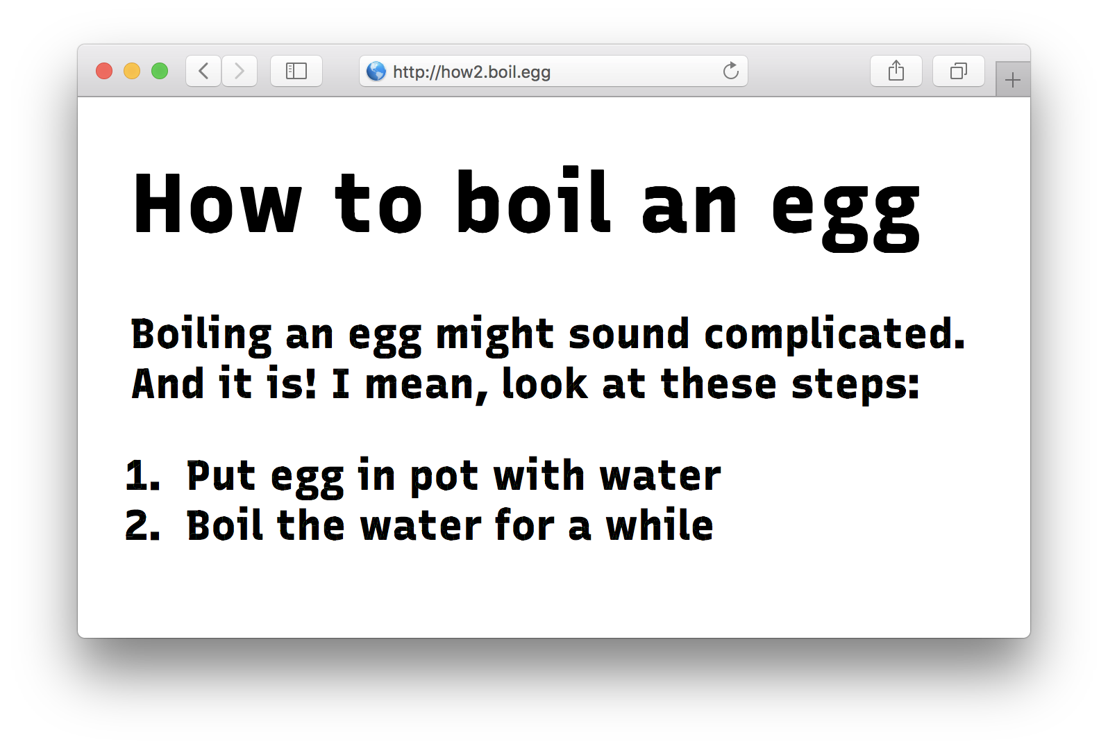
<body><h1>How to boil an egg</h1><p>
Boiling an egg might sound complicated. And
it is! I mean, look at these steps:
</p><ol><li>Put egg in pot with water</li><li>Boil the water for a while</li><ol></body>
All the text inside the h1, the p, and the li elements now have a font weight of 666 instead of the default 100.
So far, so good! Look at this beaut:
The inheritance problem
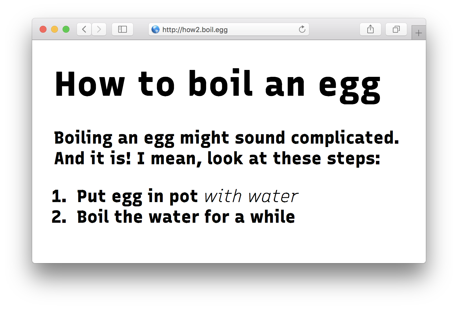
Now, a common culinary cock-up in boiling an egg is that people forget to put water in the pot. Since the presence of water is vital to boiling, let’s stress this fact:
<body><h1>How to boil an egg</h1><p>
Boiling an egg might sound complicated. And
it is! I mean, look at these steps:
</p><ol><li>Put egg in pot <em>with water</em></li><!-- Stressed! --><li>Boil the water for a while</li><ol></body>
Nice! The “with water” part is now wrapped in em tags. Let’s make the font super italic-y by setting the slant axis (slnt) to the maximum of -14 instead of the default 0:
Oh no! What happened to the weight of 666 inside our em tags?! It’s gone, reset back to the default of 100. The slant is correct, but the font is all skinny!
We stumbled upon the inheritance problem.
What’s going on then?
The problem is this: whenever setting a value for font-variation-settings, the values you don’t set get reset back to their defaults. Because we don’t set the wght to 666 in our em tag, the browser will use the default of 100 when rendering font.
Our current CSS is small and simple. But still we already have a duplicated value. The more variations of our font we’ll add, the more exceptions and combinations we’ll have to write. This’ll turn into maintenance hell really quickly!
Cascading Cackleberry
You know what cascades really well, though? CSS custom properties, also known as CSS variables! What if instead of setting font-features-settings directly, we use CSS variables?
First we create unique variables for each axis, and set them to their default values. We do this on the :root element so these values will trickle down to every other element on the page.
We then apply these CSS variables to the axes of Cackleberry. All axes, at the same time! We do this on the * element, so it will be applied to every element on the page. If Cackleberry gets applied to that element too, it will get the proper font-variation-settings, and render as intended.
We now arrive at our body styles. Since body inherits from :root, it will get all of :root’s CSS applied as well. So in effect the CSS for body is:
body{/* Inherited from :root ----------------------------- */--cackleberry-wght:100;/* Will get overridden */--cackleberry-slnt:0;/* Applied through * selector ----------------------- */font-variation-settings:"wght"var(--cackleberry-wght),"slnt"var(--cackleberry-slnt);/* Direct styles for body --------------------------- */font-family:Cackleberry;--cackleberry-wght:666;/* Overrides the default value */}
Since --cackleberry-wght: 666 is applied to body directly, it overrides the value we inherit from :root. This means that the values fed to the font-variation-settings rule are now: "wght" 666, "slnt" 0.
So far so good. We’re now at the same point of our first example: the entire page gets rendered in Cackleberry in wght 666.
But here’s where it gets interesting, the styles for the em element:
em{--cackleberry-slnt:-14;}
Again, instead of setting font-variation-settings directly, we set our custom CSS variable for the slnt axis. The other values cascade down from above, and are not affected. That’s significant! Because if we would’ve set font-variation-settings, they would have been affected by being reset back to their defaults.
Effectively, the CSS for em now looks like this:
em{/* Inherited from :root and body -------------------- */--cackleberry-wght:666;/* Inherited from body */--cackleberry-slnt:0;/* Will get overridden *//* Applied through * selector ----------------------- */font-variation-settings:"wght"var(--cackleberry-wght),"slnt"var(--cackleberry-slnt);/* Direct styles for em ----------------------------- */--cackleberry-slnt:-14;/* Overrides the default value */}
So when that font-variation-settings rule gets applied to em, the values will be equivalent to this:
em{font-variation-settings:"wght"666,"slnt"-14;}
And that’s what we want! Set one value and leave the others at their inherited value, instead of resetting them. No more hard-coded font-variation-settings values for every single element!
Works for OpenType features too
This approach works for font-feature-settings too, the CSS property to tweak OpenType features:
In this example, small caps (smcp) and stylistic set #1 (ss01) are now individually turn-on-and-off-able, without fear of resetting a previously set OpenType feature. If you want to turn on ss01 and leave smcp at whatever it was, you can do:
div{--ss01:on;}
Wakamai Fondue?
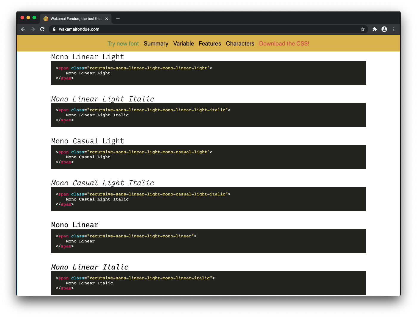
If you’re using Wakamai Fondue to inspect your fonts, you might have already seen this trick in use:
Generated CSS for Lato's OpenType features
Wakamai Fondue analyses any font you drop in the site, and spits out all the CSS you need to tweak variable axes and OpenType features, using the CSS variable hack.
Note that Wakamai Fondue uses a slightly different approach than our examples, by generating classes for each feature. You can just add the class for the feature you want to any HTML element, and the CSS will do the rest:
.cackleberry-smcp{--cackleberry-smcp:"smcp"on;}
To better explain what’s going on, Wakamai Fondue also puts the feature name (smcp in this example) in the variable, instead of just on or off.
The effect is the same: this specific feature/axis is set, the rest is left at their inherited value, instead of being overwritten. Any element with the class cackleberry-smcp will get small caps. Great!
Registered axes and font-variant
To demonstrate this trick I’ve been using the wght and slnt axes here, but these registered axes are really meant to be set through font-weight and font-style. Same goes for the small caps example up here: these are best set with font-variant-caps. Only when this isn’t supported you should fall back to low-level properties like font-variation-settings and font-feature-settings.
Eggs are done!
I think this is a nice way to circumvent the inheritance problem with font-variation-settings and font-feature-settings. It works in every browser were variable fonts are supported, as they’ll also support CSS variables.
Some care should be taken when you have multiple variable fonts, as you probably want to be a bit more specific with which elements get the variable-infused font-variation-settings rule applied.
I hope this trick helps you make awesome variable font sites! And perfectly boiled eggs.
Thanks to Stephen Nixon for Recursive, used in the Cackleberry screenshots! Also thanks to Stephen, Bram Stein and Scott Kellum for valuable feedback on the first drafts of this article. 💖
]]>You’ve gotten old, bulletproof @font-face syntax. Time to retire!2019-09-04T02:00:00+02:002019-09-04T02:00:00+02:00https://pixelambacht.nl/2019/youve-gotten-old-bulletproof-font-face-syntax2009 — the year Michael Jackson died, Obama became president of the USA, and Avatar hit the silver screen.
Kanye West told Taylor Swift “I’mma let you finish”, David asked “is this real life” after a trip to the dentist, and Susan Boyle’s audition on Britain’s Got Talent became an internet video phenomenon.
And we all got the Trololo earworm
Nokia still ruled the mobile phone market. Apple’s iPhones, released two years prior and now running iPhone OS 3, held just 13.7% of the market. Android, with version 1.6 (nicknamed Donut) held a mere 2.8%.
Emoji wouldn’t come to these phones for another couple of years.
iPads and other tablets were not even on the horizon yet. Netbooks, specifically the Eee PC, were the summit of mobile computing.
We surfed the web with Chrome 3.0, IE8, Firefox 3.5 and Safari 4. Our computers were being asked if they could run Crysis.
Support for webfonts had just grown from Internet Explorer’s proprietary EOT format to TTF and OTF in Firefox, Safari and Opera. The WOFF format was still being drafted by Jonathan Kew, Tal Leming, and Erik van Blokland.
The bulletproof @font-face syntax is born
It was around that time when Paul Irish tried to make sense of all these different formats, and introduced the bulletproof @font-face syntax. This little snippet of code tried to make sense of all the various formats, bugs, quirks and scattered support. It provided for IE6 users, by then a browser that was already 8 years old. It explained how to turn on @font-face support in Chrome’s dev builds. It treated WOFF as the futuristic new font format is was back then. WOFF2 isn’t even mentioned at all.
The way the web looked back in '09
But time ticks by, and now it’s 2019. The bulletproof @font-face syntax is celebrating its 10th year. It’s a decade old.
WOFF2 has superseded the once futuristic WOFF, and has been supported by major browsers for many years.
The group of people using antiquated hardware running crippled OSes and severely outdated browsers that need EOT, OTF/TTF or SVG fonts is so minuscule, that forcing webfonts on them feels inconsiderate instead of helpful. Maybe there’s accessibility or performance issues to be solved instead!
In 2019, your font loading strategy is better off by include a great fallback stack. Even in modern times, in evergreen browsers on spectacularly powerful devices, fonts can fail to load. Your visitors will be grateful to still be able to read your content — whether their train just entered a tunnel or they’re surfing on a decade old beige PC running Windows XP.
Thank you, bulletproof @font-face syntax
Thanks for providing us with a robust snippet when the webfont days were wild, support was super sketchy, and we needed some help getting to get our awesome webfonts to work. You’ve been a great little blob of CSS. But you’re 10 years old – that’s ancient in internet years!
Today, WOFF2 with WOFF as fallback, combined with a thoughtful fallback font stack, respectfully take your place in the web developer’s toolkit.
You’ve gotten old, bulletproof @font-face syntax. Time to retire!
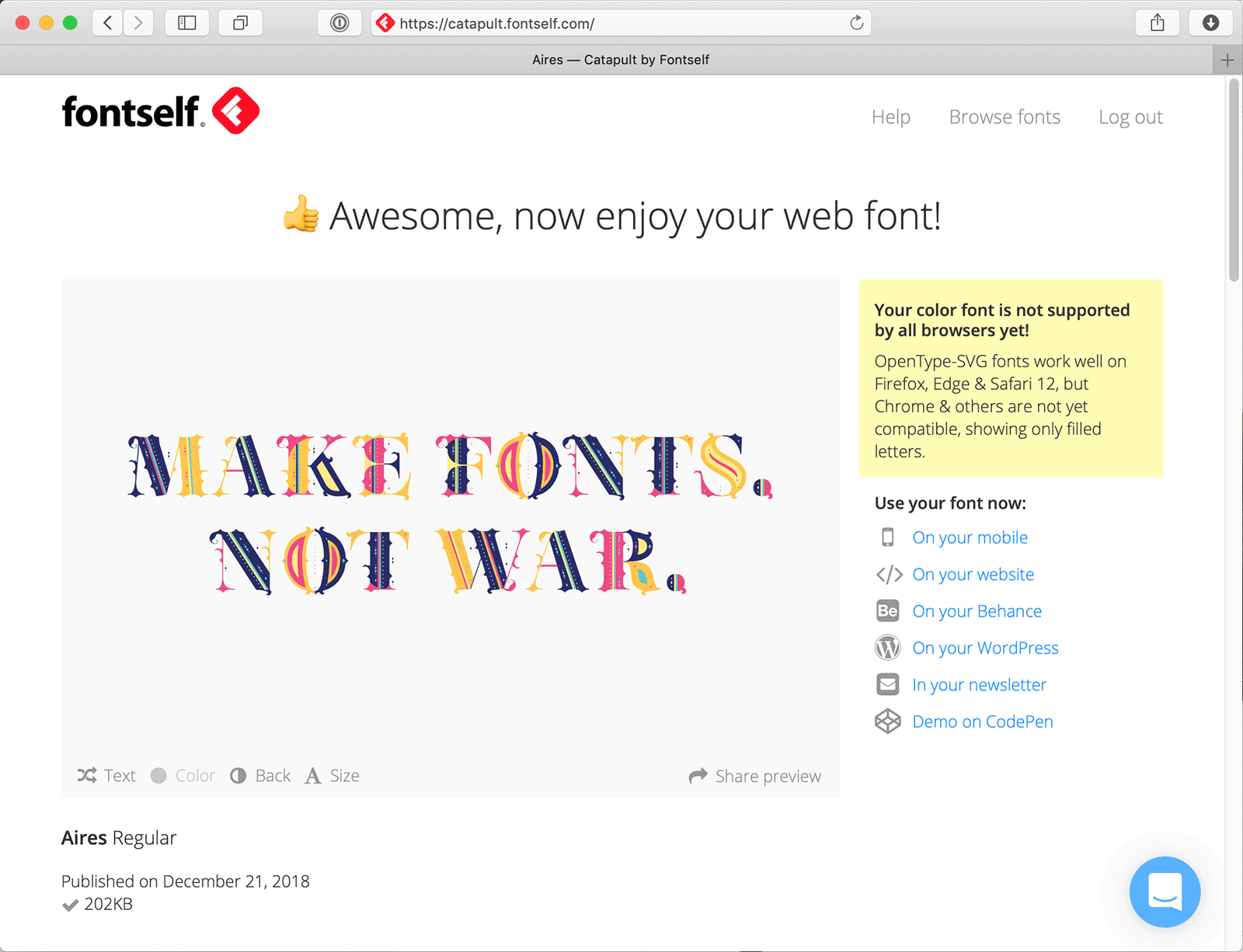
]]>Creating Fontself Catapult, a color font publishing platform2019-01-18T01:00:00+01:002019-01-18T01:00:00+01:00https://pixelambacht.nl/2019/fontself-catapult-color-font-platformAbout a year ago I was contacted by the people from Fontself, a software company from France and early adopters of color fonts, to work on a new project. They already had Fontself Maker, a tool to create fonts from the comfort of Adobe Illustrator, and were planning to add a new service to help designers publish their fonts on the web. The intersection of webfonts and color fonts is of course exactly my sweet spot, so when they asked me to help out I said “oh heck yes!”
What should a font publishing tool do?
Fontself Maker as a font design tool was already well established: it converts anything you can create in Illustrator into a font. You draw the letter A, tell Fontself Maker it’s an A, and it magically takes care of creating a font of it. You can save it as an OpenType .OTF file, which you can distribute and use like any other font. It even lets you create color fonts!
The new publishing platform, named Fontself Catapult, was going to be an extension to allow you to publish your font specifically for the web. It wouldn’t just create a WOFF/WOFF2 file, but also offer whitelisting, all the needed HTML and CSS, assistance for various platforms like WordPress or CodePen, and a custom specimen page. Oh, and highly optimised hosting so fonts would be as easy and performant as, say, Google Fonts.
A video explaining the what’s what of Fontself Catapult
Technical challenges
If you build a font publishing and hosting platform for non-technical folks (graphic designer and creatives), there’s a whole list of details you need to get right:
The font should work everywhere, and be optimised and free of bloat and bugs.
The hosting should be fast, reliable and have a basic defense against abuse and piracy.
The publishing service should be very easy to use, but also allow fine grained control to advanced users.
And because Fontself also allows you to create color fonts, the service has to be extra resilient: there will be users on browsers out there without support for color fonts. With Edge switching to Chromium, they will (hopefully temporarily) lose support for OpenType-SVG, one of the most versatile and interesting color font formats. The designer and the website’s visitors should be treated to a good experience either way.
Getting it right
We didn’t want to burden the font designers with too many options when publishing their font, so we needed to decide on some sane defaults.
Consider the font loading strategy. How do we want the browser to handle these fonts? Without knowing the priorities of the websites that are to be built with Fontself fonts, it’s hard to make one-size-fits-all default. For a portfolio site sporting an extravagant display font, it doesn’t make sense to show the text in a fallback font. Because in that case the look and feel, or even the font itself, is more important than the textual content. You’re not there to read about what the quick brown fox is doing — you’re there to see the slick design.
On the other hand, if you’re creating a breaking news site, it’s preposterous to keep users from seeing the content until your font has loaded.
After careful deliberation (the “three days locked up in a basement meeting room in Paris” kind of deliberation), it was decided that, considering the Fontself audience, the font had a high priority and should be on screen as soon as possible.
This resulted in a few decisions:
We ask the browser to keep the text invisible for as long as possible, using font-display: block, until the font has loaded.
In the case of color fonts, we educate the designer as best as we can about support, and lack thereof, so they know exactly where their fonts will work.
No JavaScript; the user should be able to use the fonts through some simple HTML and CSS.
This will try to get the font on screen as soon as possible. We basically ask the browser “do everything you can to show the text in our font, and hide the text in the meantime”. On a slower connection, the text will not be shown in a fallback font until the proper font has loaded. The browser will obey this up to a few seconds, after which it’ll overrule our wish and show the text in the fallback font — until the webfont has finally downloaded.
Serving fonts
Fonts are served in WOFF2 and WOFF only: legacy formats are not only less relevant by the day, but this service is aimed at the future. We’re relying on modern browser features, both in font loading strategies as color font support, so we use the font format tailored specifically for the web.
Securing webfonts is nearly impossible, but we try to do everything to prevent unlicensed use. Sites that use the font need to be whitelisted, so you can’t just copy the CSS and use it on another site.
Gilbert Color, created in Fontself Maker and published with Fontself Catapult
Color fonts
Finally, we had to tackle color font support. Fontself has been evangelising color fonts for a long time, and runs colorfonts.wtf, so it was important to get this right.
Support for color fonts is increasing, and has even expanded beyond browsers to Adobe software and Apple’s operating systems. But there are still browsers out there that don’t support color fonts. What to do with those? Sure, they’ll see the single color “fallback” that’s included inside the font, but is that good enough?
We decided on the following strategy: Catapult will clearly educate the designer about color font support, so they can decide for themselves if this an issue or not. On the live specimen page generated by Catapult, the designer can see per browser which format is supported, and what people will see when they see the fallback. Of course, we’re using ChromaCheck to check for browser support.
Besides that, we also decided to warn the user if the generated font would start to get too big for proper web usage. Color fonts don’t necessarily have to be big, but with enough complexity in the letterforms and lots of colors, it’s good to get a heads up when the font is getting fat.
And then there was light
We had out battle plan ready, and the Fontself folks picked it up from there. A few months later, Fontself Catapult saw the light of day! 🎉
Personally, this was the first time being involved in an extensive color font project, one that put the creation of fonts in the hands of everyone with access to Illustrator. The project truly went from A to Z: from drawing the characters as you like, to publishing a highly optimised, robust font on the web.
Example page for a font built with Fontself Catapult
]]>Extra, extra! Read all about it! (Once our webfonts have finished downloading)2018-11-11T01:00:00+01:002018-11-11T01:00:00+01:00https://pixelambacht.nl/2018/extra-extra-read-all-about-itNews sites are probably more concerned with putting the written word on screen quickly than any other type of site. You can’t have your browser dilly-dallying around with webfonts while the visitor is impatiently waiting to read the latest breaking news, now can you? Turns out, some news sites can.
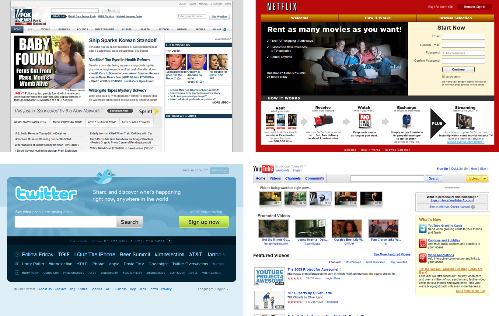
Let’s look at how some of the big boys in the news sector do, font-wise, and see if we can improve things. After checking the very first result in duckduckgo careful research of who the biggests news sites are, I had a list of six sites to investigate:
Yahoo! News
Google News
HuffingtonPost
CNN
New York Times
Fox News
My toolkit consists out of an incognito desktop browser window, Wakamai Fondue, TTX/FontTools and a lazy Sunday afternoon.
I check just the homepage, on an empty cache, no ad blocker, no clicking through to articles, and no scrolling to trigger additional content.
While looking for how to optimise the fonts used, I’m not concerned with subsetting or stripping OpenType features, as I’ll assume the news sites will use the full character set and all the layout features a font offers.
With that out of the way, let’s read some newspapers!
Yahoo! News
Yahoo! News uses system fonts (a boring stack of Helvetica, Arial and sans-serif), an approach fitting for news sites. Content is king, and having content visible on screen a.s.a.p. is of the utmost importance.
Verdict: Fast, functional and boring, Yahoo! News only uses a simple font stack of local fonts.
Google News
Google News loads a surprisingly large amount of fonts: eight fonts, amounting to 158 kilobytes. They’re also used in kind of a weird mix.
First font loaded is Product Sans, which includes contextual alternates and contextual ligatures used to display icons like the Google logo, temperature notations and custom smileys and arrows. But in the end, it’s only used in the header: a nearly 13KB font just to draw the word “News” next to the Google logo in the header.
Google Sans Display Regular comes in three weights. It has OpenType features which could come in handy on a text and data heavy site like a news site: fractions, tabular figures and a bunch of standard ligatures. Also, it has more ligatures to evoke the Google logo and icons. These are icons duplicated across all three files. Oddly enough this font is only used for the navigation, non-news headings and some other odds and ends.
Roboto Regular, Medium and Bold are used for news related content, like titles and meta info, and for the “Sign in” button in the header. Maybe there’s a strict style guide, but why not just use Google Sans Display here too?
Odd font out is a 70KB icon font named Material Icons Extended. It contains 1528 different icons, of which part is mapped to the usual Unicode PUA codepoints (0xE000 to 0xEB4F, and a bull icon at 0x10FFFD) and part is mapped to ligatures for strings like “bottom_navigation” and “battery_charging_full”.
For the buttons to switch between temperature units, the system font is applied. Why aren’t they using one of the webfonts there, I wonder?
Verdict: Everything is obviously served over the heavily optimised Google Fonts network, so not much to gain there. Stripping the duplicate icons could save a handful of kilobytes. Why this page needs three different geometric sans serif typefaces scattered across the page is a bit of a mystery to me.
Huffington Post
The Huffington Post also uses icon fonts. It serves these as a 9.6KB WOFF. With some basic optimizations, and serving the font as a WOFF2 saves 2.5KB. Not bad for 47 seconds of work.
They also serve five weights and widths of Proxima Nova from their own servers, totalling 334 KB in WOFF fonts. Weirdly they serve the bold version as a TrueType font, which is double the size of any of the other four CFF (OpenType) fonts.
Why they don’t serve WOFF2 is another bit of a head scratcher to me.
The fonts come with a full set of OpenType features: all kinds of alternates, stylistic sets, small caps — the lot. It feels like overkill, as at a quick glance most of these don’t seem to be used. The fonts are loaded through JavaScript and injected as base64 encoded strings in CSS files.
Verdict: Suboptimal compression, base64 serving and and overkill of OpenType features leaves a lot to be improved. Some basic optimisations and using WOFF2 instead of WOFF will save 100KB on an empty cache!
CNN
CNN serves its own bespoke font: CNN Sans, a mundane, boring Helvetica clone. It’s packed with OpenType features, and even includes around 90 icons for things like the CNN logo, weather icons, and generic site UI stuff. There are even PUA codepoint for ligatures. The icons are duplicated in all four weights (and even the italics), which sounds unnecessary.
With all these icons embedded in their regular fonts, it’s weird that another font is loaded which contains even more icons. There are a lot of duplicates but they are mapped to other Unicode values, making them incompatible with the embedded ones. Not a huge problem, as it looks like the embedded icons aren’t even used, but it’s dead weight nonetheless.
At a total of 205 kilobytes for the text fonts, and 21 kilobytes for the dedicated icon font, this bundle of WOFF2 accounts for almost a quarter megabyte.
Stripping the unused icons and doing some basic optimisations (but leaving all OpenType features intact) brings the total size of the text fonts down to 133 kilobytes — a savings of a very respectable 72 kilobytes! Optimising the icon font adds another kilobyte of savings.
Verdict: It looks like CNN Sans is carrying around a lot of dead weight, and it’s easy to cut over 73 kilobytes on uncessarary font data.
New York Times
Right of the bat, the New York Times pushes eleven WOFF2 fonts down the wire, at a total of 242 kilobytes.
Five versions of Cheltenham just for headlines and subtitles, one version of Imperial for body copy, and four weights of Franklin for navigation, meta info and a few dedicated link blocks to other articles. Ten fonts for just representing the text on the homepage! The fonts are well optimised and low on OpenType features, so there’s not a lot you could do to bring the total file size down.
It looks like they’re doing their own WOFF/WOFF2 support detection in JavaScript, then loading the relevant fonts base64 encoded in CSS files and storing them in localstorage for future use.
The icons are being taken care of by an icon font served as a WOFF. At 4.8KB it’s already a small font, but could be brought down to 3.3KB when optimised and served as a WOFF2.
Verdict: Apart from the rather large amount of fonts files loaded, the font files are lean and used with a well thought out font loading strategy.
Fox News
Fox News grabs three weights of Roboto off of Google Fonts, being uninteresting both in choice of typeface and opportunities to optimise.
More interesting is that they also use an icon font — a customized version of Font Awesome. It’s and older version, reduced to about 148 icons through the use of IcoMoon. You can tell because of the IcoMoon metadata left in the font file. Stripping this metadata during default optimisation, and turning this into a WOFF2 instead of the WOFF they chose to serve, brings the file size down from 30KB to 10KB.
Verdict: Nothing much interesting going on here, but the icon font could be optimised to save 20KB for each visitor with a clean cache.
Conclusion
We haven’t even dug into using less fonts, subsetting, or stripping OpenType features. Nor have we considered using variable fonts to easily reduce the amount of transferred data (while adding even more typographic freedom to boot). We just did some of the minimal, basic optimisations and already seen quite some room to improve.
I expected major news sites to be really conscious about the fonts they use, and making sure everything is heavily optimised. Turns out a simple Sunday afternoon of hacking could save a lot of data: we could easily save roughly 200KB on these six sites combined. At an estimated 665,000,000 unique visitors per month, assuming 10% visits on an empty cache, that’s 13,300,000,000 kilobytes we could save — a staggering 13 terabytes per month!