Boiling eggs and fixing the variable font inheritance problem
For this post we need the following ingredients:
- An imaginary webpage that explains how to boil an egg.
- An imaginary variable font called Cackleberry. It has two axis: weight (
wght) and slant (slnt). The weight axis goes from 100 to 900, and has a default of 100. Slant goes from 0 to -14, and has a default of 0.
With this mise en place out of the way, let’s dive in!
Variable fonts in CSS
To work with variable font axes in CSS, you use the font-variation-settings property. For instance, to set the weight axis to 666 for everything on the page, you’d write something like this:
body {
    font-family: Cackleberry;
    font-variation-settings: "wght" 666;
}
This trickles down to every element on the page, like you’d expect:
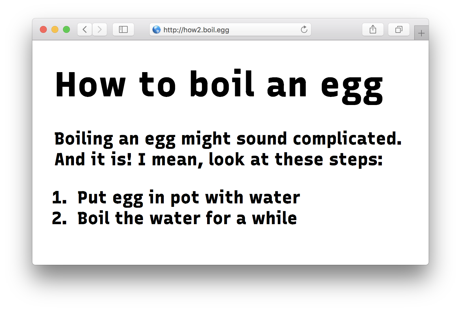
<body>
    <h1>How to boil an egg</h1>
    <p>
        Boiling an egg might sound complicated. And
        it is! I mean, look at these steps:
    </p>
    <ol>
        <li>Put egg in pot with water</li>
        <li>Boil the water for a while</li>
    <ol>
</body>
All the text inside the h1, the p, and the li elements now have a font weight of 666 instead of the default 100.
So far, so good! Look at this beaut:
The inheritance problem
Now, a common culinary cock-up in boiling an egg is that people forget to put water in the pot. Since the presence of water is vital to boiling, let’s stress this fact:
<body>
    <h1>How to boil an egg</h1>
    <p>
        Boiling an egg might sound complicated. And
        it is! I mean, look at these steps:
    </p>
    <ol>
        <li>Put egg in pot <em>with water</em></li> <!-- Stressed! -->
        <li>Boil the water for a while</li>
    <ol>
</body>
Nice! The “with water” part is now wrapped in em tags. Let’s make the font super italic-y by setting the slant axis (slnt) to the maximum of -14 instead of the default 0:
body {
    font-family: Cackleberry;
    font-variation-settings: "wght" 666;
}

em {
    font-variation-settings: "slnt" -14;
}
Let’s refresh and admire our work:
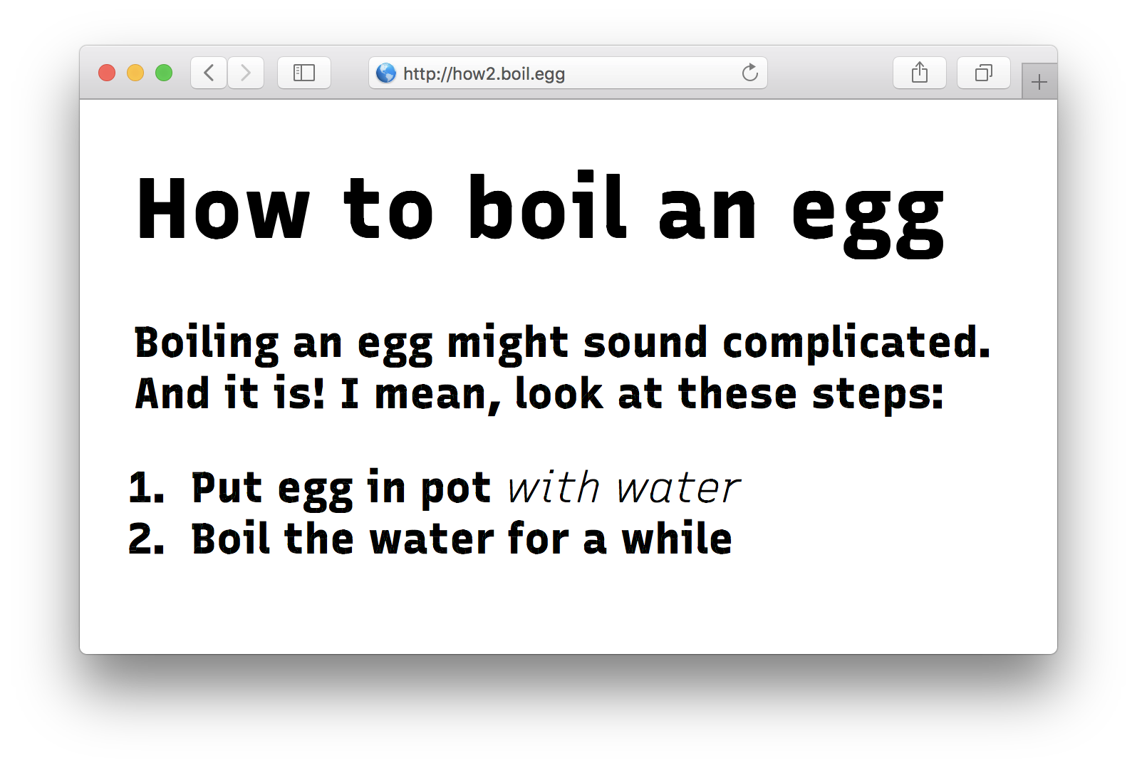
Oh no! What happened to the weight of 666 inside our em tags?! It’s gone, reset back to the default of 100. The slant is correct, but the font is all skinny!
We stumbled upon the inheritance problem.
What’s going on then?
The problem is this: whenever setting a value for font-variation-settings, the values you don’t set get reset back to their defaults. Because we don’t set the wght to 666 in our em tag, the browser will use the default of 100 when rendering font.
In effect, we have created this CSS:
body {
    font-family: Cackleberry;
    font-variation-settings: "wght" 666, "slnt" 0;
}

em {
    font-variation-settings: "wght" 0, "slnt" -14;
}
Okay, that’s annoying, but easy to fix. In this case, we could just set the proper wght and slnt for our em tag:
body {
    font-family: Cackleberry;
    font-variation-settings: "wght" 666;
}

em {
    font-variation-settings: "wght" 666, "slnt" -14;
}
Problem solved, for now:

Our current CSS is small and simple. But still we already have a duplicated value. The more variations of our font we’ll add, the more exceptions and combinations we’ll have to write. This’ll turn into maintenance hell really quickly!
Cascading Cackleberry
You know what cascades really well, though? CSS custom properties, also known as CSS variables! What if instead of setting font-features-settings directly, we use CSS variables?
Let’s create a basic setup:
:root {
    --cackleberry-wght: 100;
    --cackleberry-slnt: 0;
}

* {
    font-variation-settings: "wght" var(--cackleberry-wght),
                             "slnt" var(--cackleberry-slnt);
}

body {
    font-family: Cackleberry;
    --cackleberry-wght: 666;
}

em {
    --cackleberry-slnt: -14;
}
What’s going on here? Let’s parse this CSS:
First we create unique variables for each axis, and set them to their default values. We do this on the :root element so these values will trickle down to every other element on the page.
We then apply these CSS variables to the axes of Cackleberry. All axes, at the same time! We do this on the * element, so it will be applied to every element on the page. If Cackleberry gets applied to that element too, it will get the proper font-variation-settings, and render as intended.
We now arrive at our body styles. Since body inherits from :root, it will get all of :root’s CSS applied as well. So in effect the CSS for body is:
body {
    /* Inherited from :root ----------------------------- */

    --cackleberry-wght: 100; /* Will get overridden */
    --cackleberry-slnt: 0;

    /* Applied through * selector ----------------------- */

    font-variation-settings: "wght" var(--cackleberry-wght),
                             "slnt" var(--cackleberry-slnt);

    /* Direct styles for body --------------------------- */

    font-family: Cackleberry;
    --cackleberry-wght: 666; /* Overrides the default value */
}
Since --cackleberry-wght: 666 is applied to body directly, it overrides the value we inherit from :root. This means that the values fed to the font-variation-settings rule are now: "wght" 666, "slnt" 0.
So far so good. We’re now at the same point of our first example: the entire page gets rendered in Cackleberry in wght 666.
But here’s where it gets interesting, the styles for the em element:
em {
    --cackleberry-slnt: -14;
}
Again, instead of setting font-variation-settings directly, we set our custom CSS variable for the slnt axis. The other values cascade down from above, and are not affected. That’s significant! Because if we would’ve set font-variation-settings, they would have been affected by being reset back to their defaults.
Effectively, the CSS for em now looks like this:
em {
    /* Inherited from :root and body -------------------- */

    --cackleberry-wght: 666; /* Inherited from body */
    --cackleberry-slnt: 0;  /* Will get overridden */

    /* Applied through * selector ----------------------- */

    font-variation-settings: "wght" var(--cackleberry-wght),
                             "slnt" var(--cackleberry-slnt);

    /* Direct styles for em ----------------------------- */

    --cackleberry-slnt: -14; /* Overrides the default value */
}
So when that font-variation-settings rule gets applied to em, the values will be equivalent to this:
em {
    font-variation-settings: "wght" 666, "slnt" -14;
}
And that’s what we want! Set one value and leave the others at their inherited value, instead of resetting them. No more hard-coded font-variation-settings values for every single element!
Works for OpenType features too
This approach works for font-feature-settings too, the CSS property to tweak OpenType features:
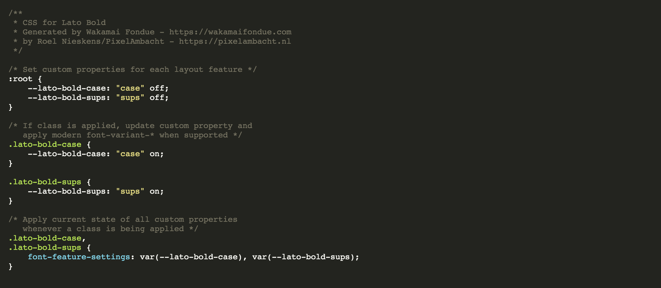
:root {
    --smcp: off;
    --ss01: off;
}

* {
    font-feature-settings: "smcp" var(--smcp), "ss01" var(--ss01);
}
In this example, small caps (smcp) and stylistic set #1 (ss01) are now individually turn-on-and-off-able, without fear of resetting a previously set OpenType feature. If you want to turn on ss01 and leave smcp at whatever it was, you can do:
div {
    --ss01: on;
}
Wakamai Fondue?
If you’re using Wakamai Fondue to inspect your fonts, you might have already seen this trick in use:
Wakamai Fondue analyses any font you drop in the site, and spits out all the CSS you need to tweak variable axes and OpenType features, using the CSS variable hack.
Note that Wakamai Fondue uses a slightly different approach than our examples, by generating classes for each feature. You can just add the class for the feature you want to any HTML element, and the CSS will do the rest:
.cackleberry-smcp {
    --cackleberry-smcp: "smcp" on;
}
To better explain what’s going on, Wakamai Fondue also puts the feature name (smcp in this example) in the variable, instead of just on or off.
The effect is the same: this specific feature/axis is set, the rest is left at their inherited value, instead of being overwritten. Any element with the class cackleberry-smcp will get small caps. Great!
Registered axes and font-variant
To demonstrate this trick I’ve been using the wght and slnt axes here, but these registered axes are really meant to be set through font-weight and font-style. Same goes for the small caps example up here: these are best set with font-variant-caps. Only when this isn’t supported you should fall back to low-level properties like font-variation-settings and font-feature-settings.
Eggs are done!
I think this is a nice way to circumvent the inheritance problem with font-variation-settings and font-feature-settings. It works in every browser were variable fonts are supported, as they’ll also support CSS variables.
Some care should be taken when you have multiple variable fonts, as you probably want to be a bit more specific with which elements get the variable-infused font-variation-settings rule applied.
I hope this trick helps you make awesome variable font sites! And perfectly boiled eggs.