Blackout: breaking browsers with a font
One way to find out how stuff works is to try and break it. It’s fun and a great way to learn about the capabilities and constraints of a technology. One of my first font hacks was trying to blow up a glyph as big as possible — a completely useless project that brought me an inordinate amount of enjoyment.
This hack is not about simply doing something like font-size: 1000000px, which would merely increase the font size, but about showing a super huge character while the font size is left at the default of 16 pixels.
Wait, what?
In a nutshell, a font is a bunch of rectangular images of letters. These images are drawn on the screen so you can read the text. If the CSS says font-size: 16px, these images will be drawn on a line 16 pixels tall. The letters in the font won’t usually be 16 pixels tall but the font will work within that space, leaving some space for ascenders, descenders and some room between lines.
But the design of a letter can run outside its rectangular confinement. There’s a part that takes up actual space, and there can be parts that are able to float about freely. This is not a bug or a hack, but actually a feature, and one you might know from fancy brush fonts:

Little boxes
We’re going to exploit this free floating space to build a glyph that expands far beyond the bounding box of a regular glyph. To see how that can be done we need to take a look at how a all the character designs are stored in a font.
In OpenType, all characters live in boxes. These are called em squares, or bounding boxes. Inside this box, a font uses a coordinate system in which the outlines of the characters are drawn. This coordinate system doesn’t relate to anything outside the font, like print sizes or screen resolutions, but is a merely the grid the designer chooses to draw on. For the average font, a resolution of about 1000 points, or unitsPerEM, for this grid suffices.
The OpenType spec describes this box as:
The em square defines a two-dimensional coordinate grid whose x-axis describes movement in a horizontal direction and whose y-axis describes movement in a vertical direction.
And its coordinate system as:
The grid origin has the coordinates (0,0). The grid is not an infinite plane. Each point must be within the range -16384 and +16383 FUnits.
This means that if you draw a square glyph of 1000×1000 units, you’ll have roughly 15000 unused units to all sides of that square. Let’s try and fill that space!
Blackout
Blackout is a font with a unitsPerEM of 256, and a glyph of 32768 units wide and tall (going from -16384 to +16383). That’s 128 times the size of what a normal glyph would be in that font. When shown on a webpage at a font size of 16 pixels, this glyph would be 2048 pixels wide and tall!
If we stuck with a unitsPerEM of 1000, the glyph would only be 32 times larger than a normal glyph, resulting in a measly 512 pixel glyph.
The mathematically inclined reader will observe that 256 is in fact not the lowest number known to mankind. Why not go for an even smaller grid and get even huger glyphs? Earlier versions of Blackout did have a unitsPerEM value of as low as 2, but that’d either crash the build tools, or completely freeze the OS or browsers. A value of 256 seemed like a sweet spot where you could observe Blackout in action without too much slow-down and crashes.
In case you’re wondering how the data looks like, here the character dumped as XML with the awesome TTX/FontTools:
<TTGlyph name="blackoutglyph" xMin="-16383" yMin="-16383"
  xMax="16383" yMax="16383">
  <contour>
    <pt x="-16383" y="16383" on="1"/>
    <pt x="16383" y="16383" on="1"/>
    <pt x="16383" y="-16383" on="1"/>
    <pt x="-16383" y="-16383" on="1"/>
  </contour>
  <instructions><assembly>
    </assembly></instructions>
</TTGlyph>
But what does it do?
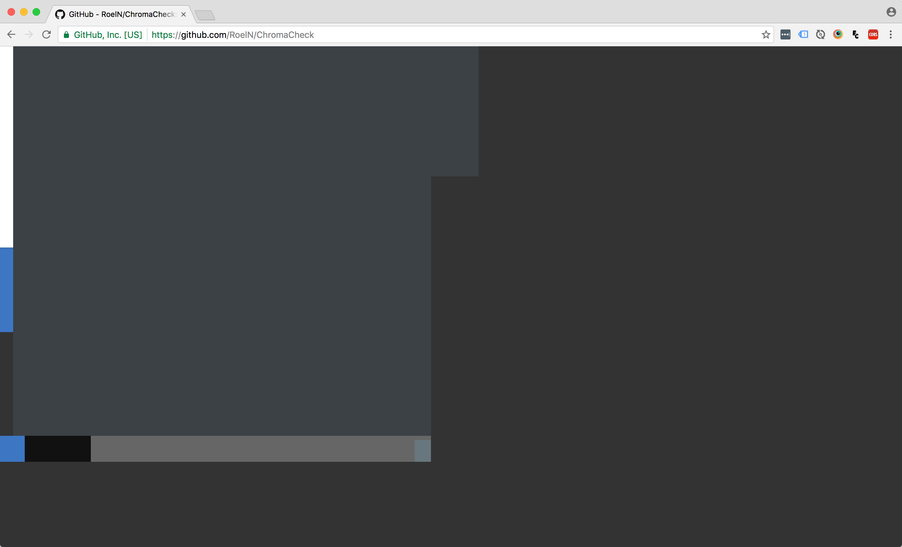
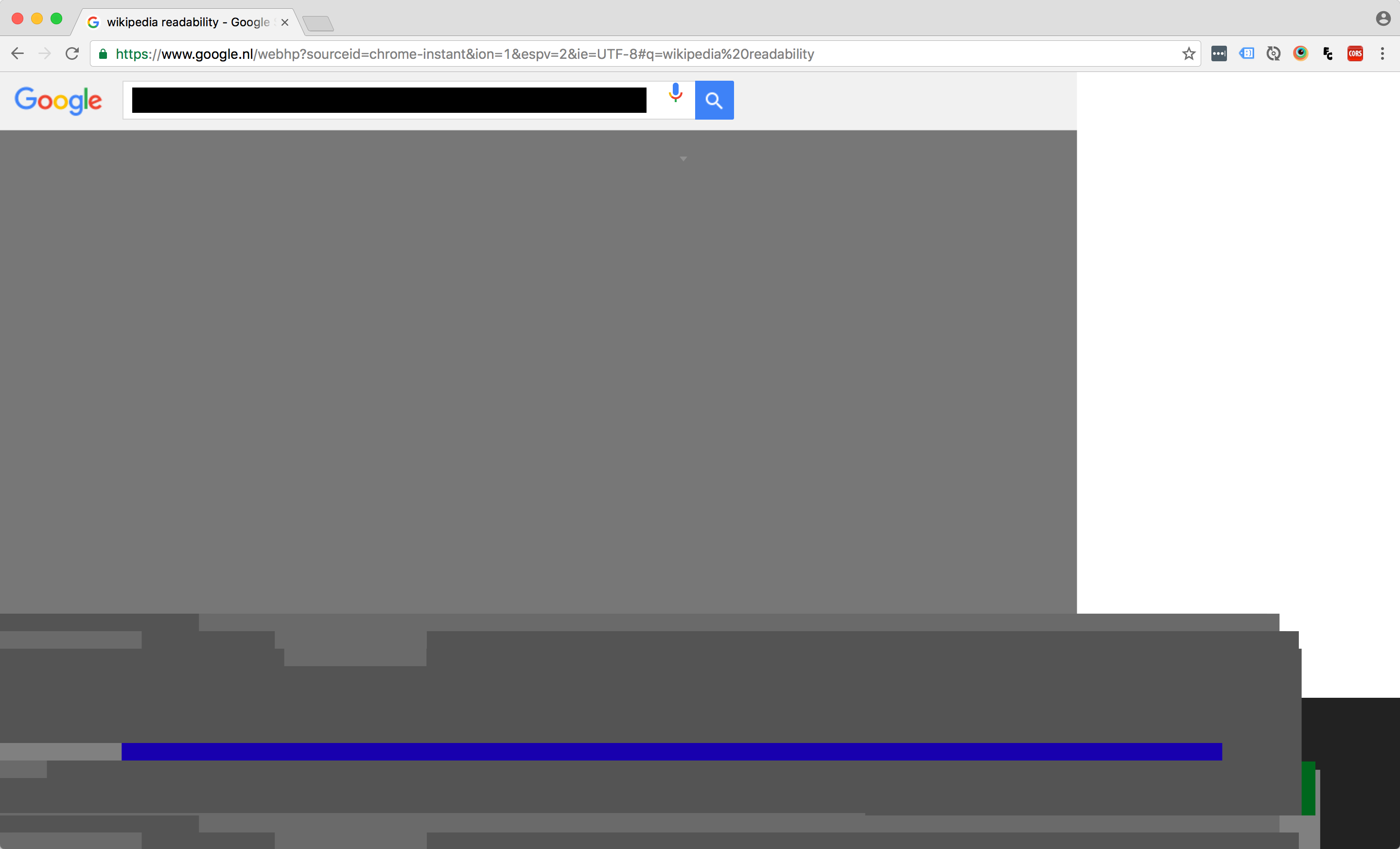
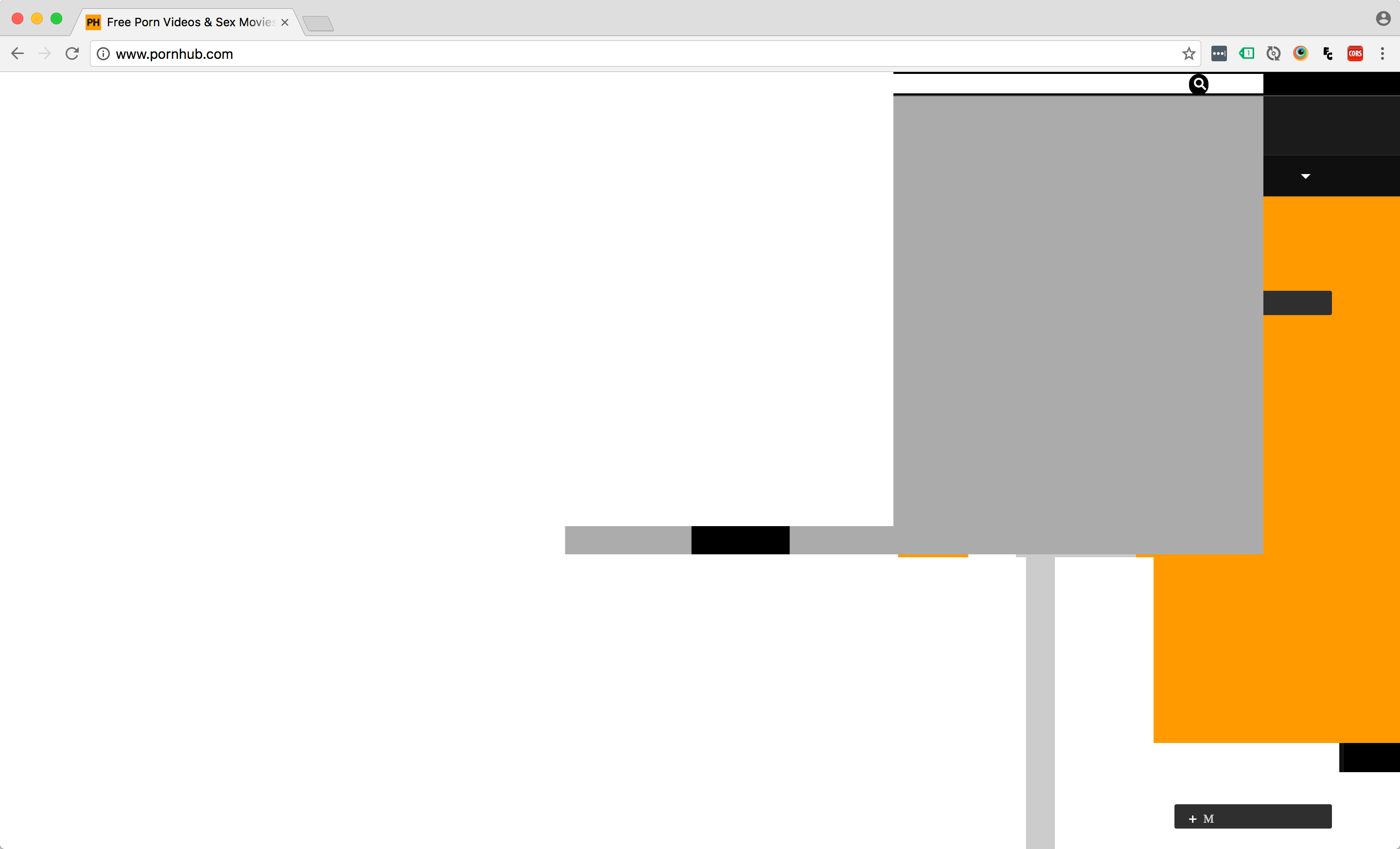
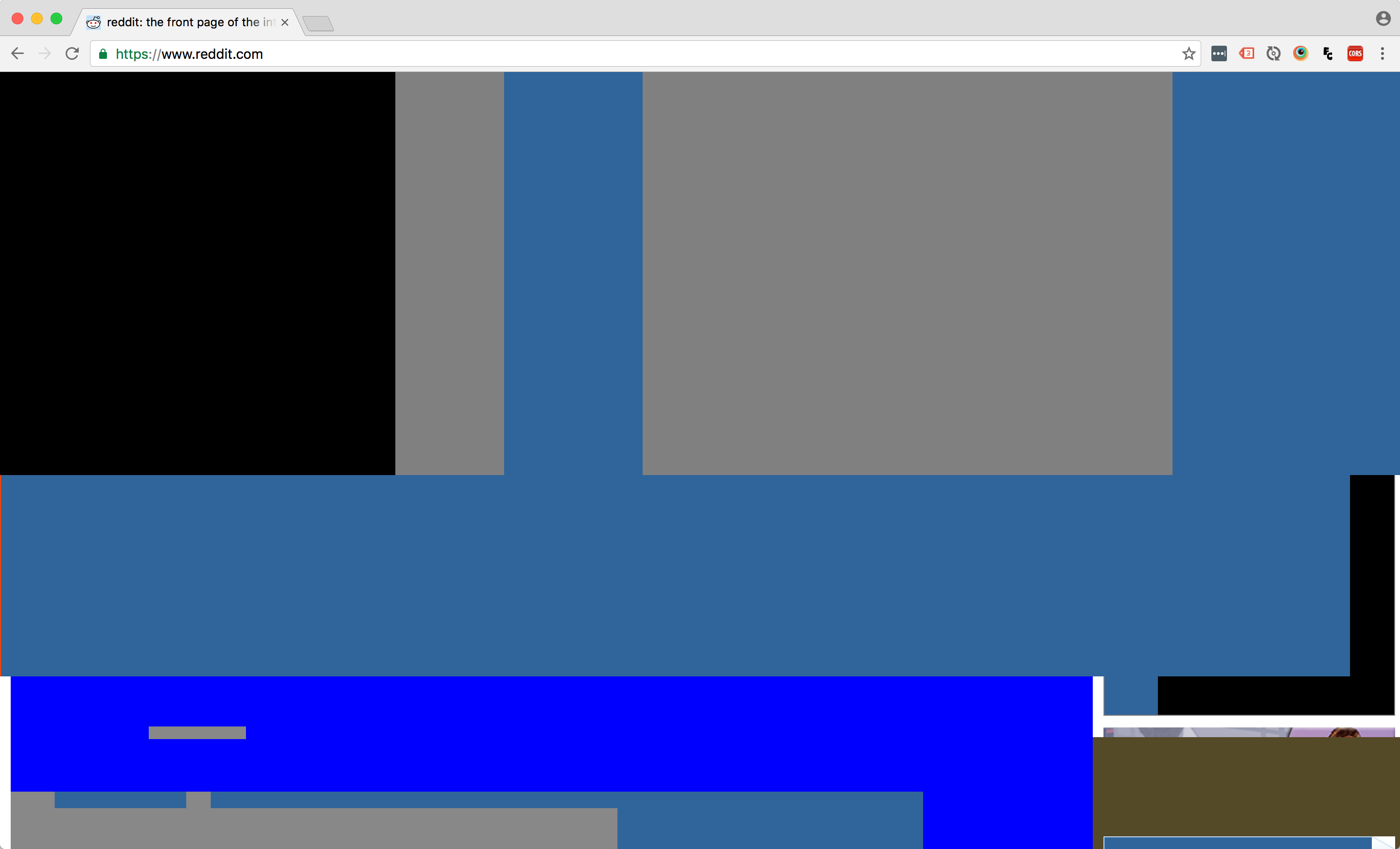
At 2048×2048 pixels per glyph, well, one single character of this font blacks out the entire browser viewport.
Oh. What does that look like?
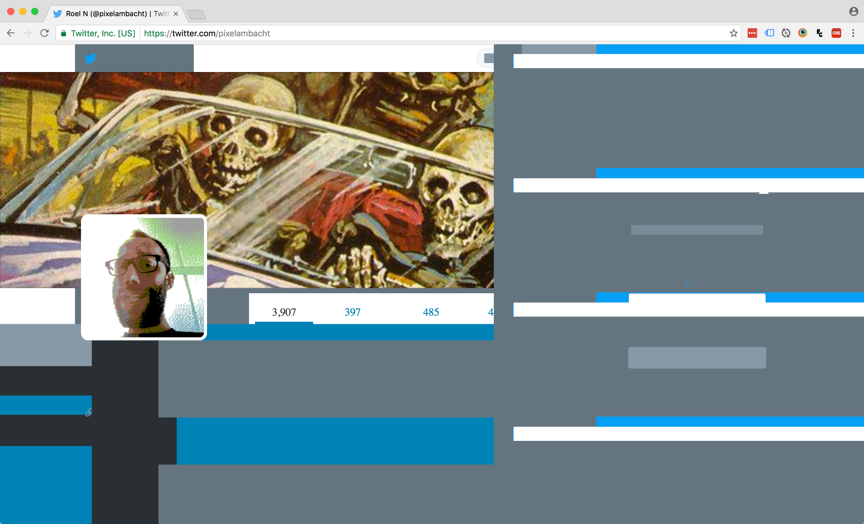
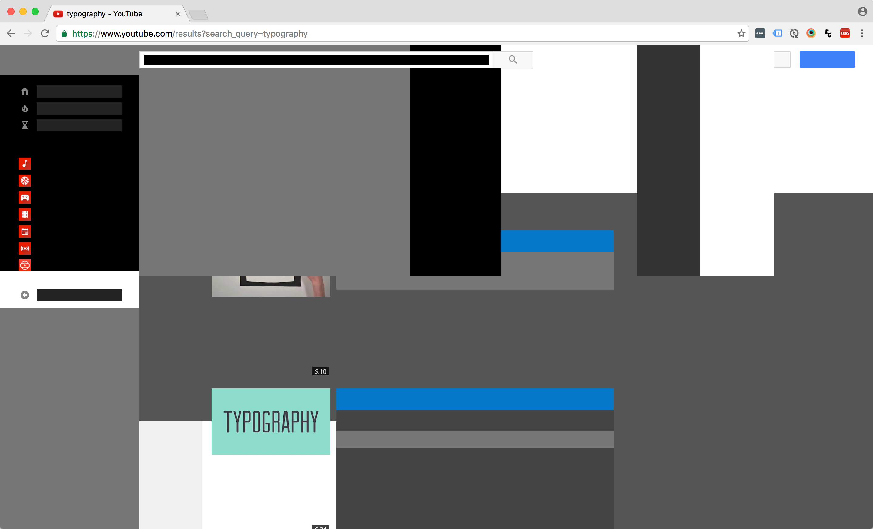
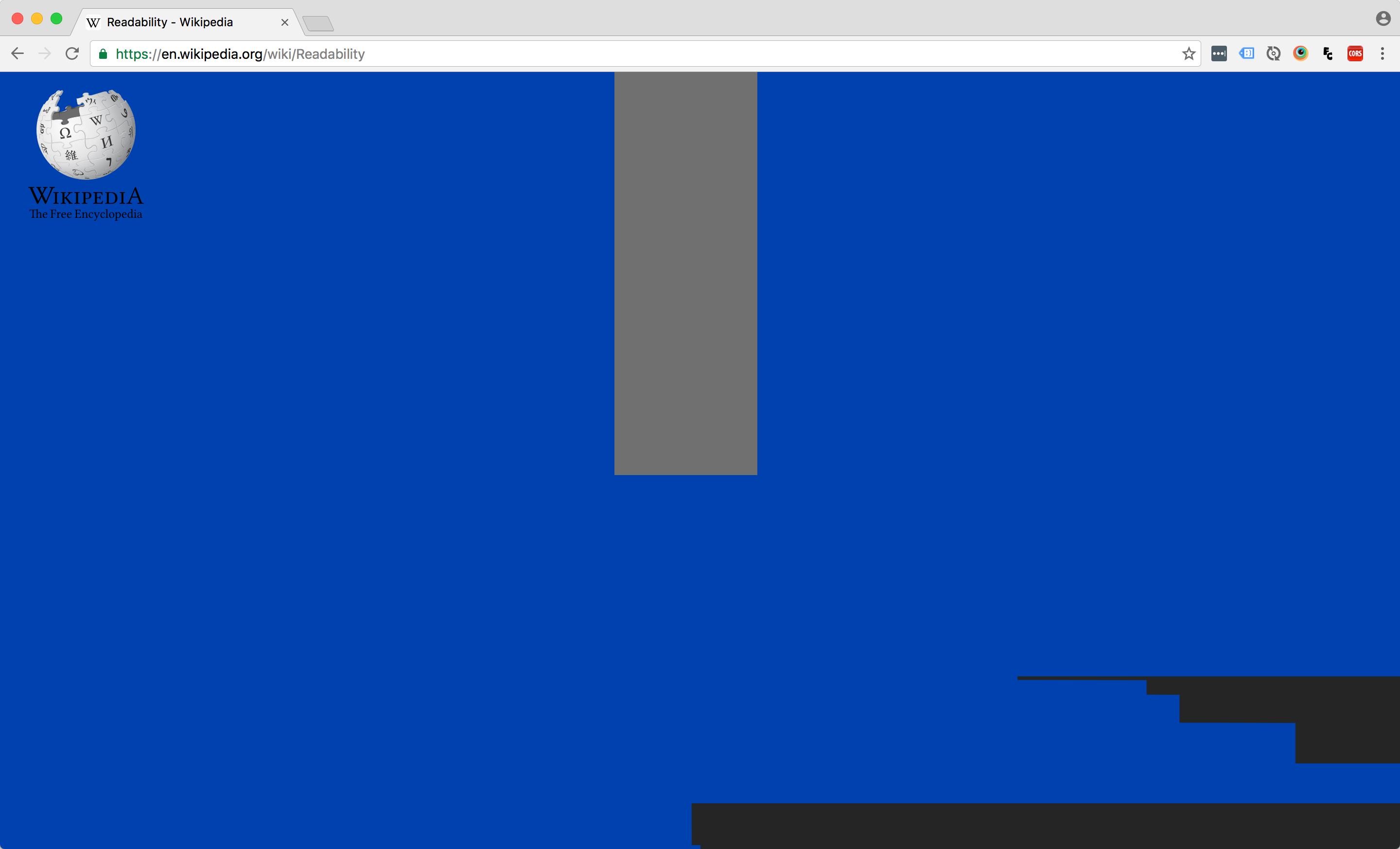
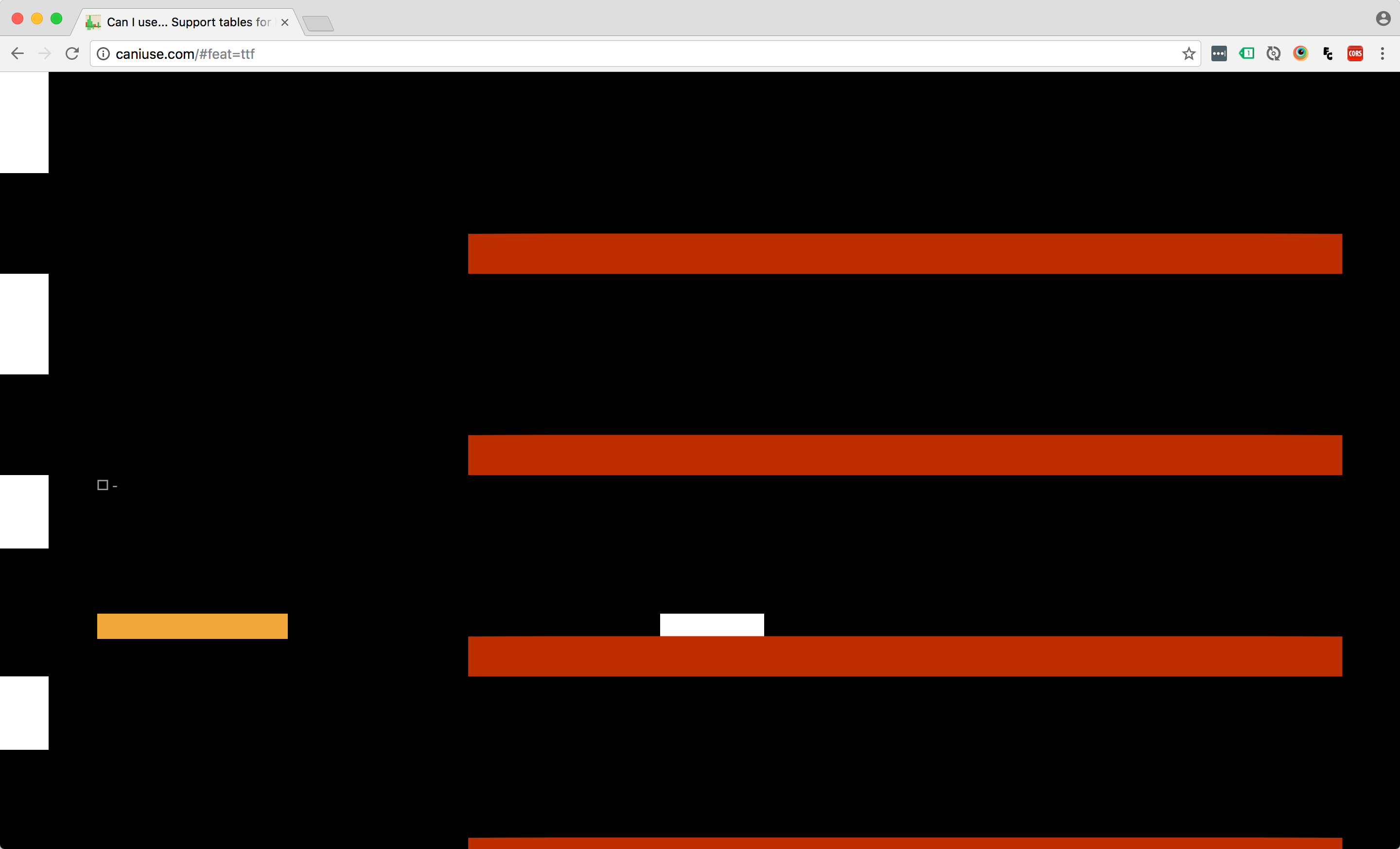
Here’s some websites with Blackout as the main font. Can you guess which site is which?
Educational takeaways
So there we have it: a completely useless font that’ll drive render engines nuts and produces nothing but glitchy, Mondriaan-esque webpages. Hooray! Check out the font’s internals on Github or see how it behaves in this test page. You can also download PixelAmbacht™ Blackout™ and mess up your wordprocessin’.
What did I learn, you ask? Well:
- Huge glyphs are super slow
- Glyphs get cut off when the viewbox stops, e.g. a
divwithoverflow: hidden, input elements, the browser’s viewport and iframes - Most browsers dutifully draw the glyphs, but Safari doesn’t draw anything
- It’s smart to spare the poor render engine from having to draw super huge glyphs for each character, so Blackout just blacks out the vowels.
But most of all:
- It’s a lot of fun to mess around and try to break stuff to see how it works!