Dev diary #002: Scaffolding and figuring outing
This week was about covering more groundwork: fleshing out the website, and working on the underlying engine. This is that magic moment where the codebase is devoid of legacy, TODOs and cut corners. Not surprisingly, as it also doesn’t contain a lot of code.
But that changed quickly! After setting up a fresh new Vue project, I started scaffolding and porting over all the components that make up Wakamai Fondue. It’s all based on dummy data so I don’t have to rely on the underlying engine to provide me with actual font data.
In order to warm up I decided the first feature should be the one that has been most requested: drop a font anywhere on the page. In the old Wakamai Fondue you could only do that on the header, requiring you to scroll up all the time. Well, not anymore!
To HTML or not to HTML
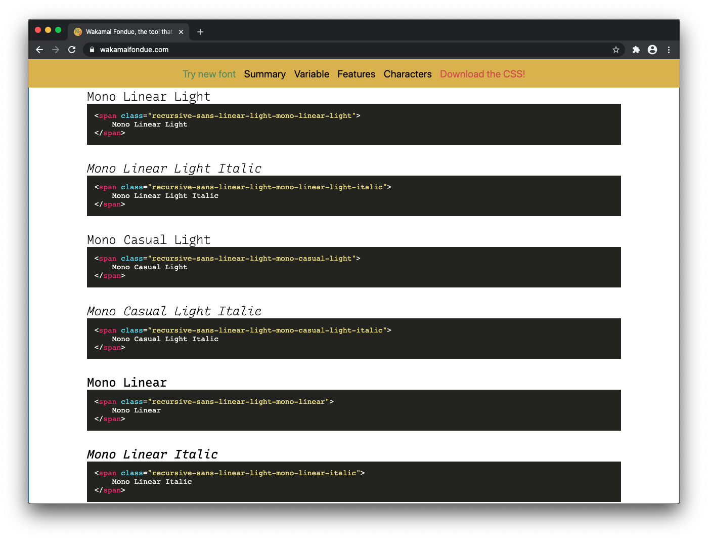
I left out all the HTML examples. They weren’t really helpful and cluttered up the page. I want to bring them back in a more useful way, and I’m considering a few ideas:
- Show HTML examples in the CSS part
- Don’t show HTML examples, and make the classes in the generated CSS speak for themselves
- Some kind of sitewide “Toggle HTML examples” button to turn the HTML/CSS example on or off

The second option would be cleanest, as it would save a lot of space taken up by something that’s just a tag with a class containing some unrelated sample text. Gets repetitive if you show this for 64 named instances…
Named Instances
Taking about those: how to show them in Wakamai Fondue? The old Wakamai Fondue shows them in a dropdown with the tester, and later on renders each name in the style of that instance. I’m not happy with both approaches: the dropdown hides the names of the instances, and it’s cumbersome to flip through all of them. The big list (again with superfluous HTML examples) is very long.
The primary focus should be discoverability: which ones are there, how are they called, how do they look. My current plan is to simply dump the named instances in the order they appear in the font, and not intervene with grouping based on axes values (e.g. group all instances with a weight of 200) or instance name parsing (e.g. group all instances with the word “mono” in them). This doesn’t seem very robust and it’d be a lucky guess if that’d result in logical grouping for any font.
I asked for advice on Twitter and the comments were incredibly helpful. (Be sure to click random timestamps, “x more replies” buttons etc. as Twitter hides a lot of replies in their unhelpful approach of threading.)
A few interesting ideas from that Twitter thread:
- Highlight any named instance that’s close to the current slider settings. This would help you “snap” to a predefined named instance instead of using a custom instance.
- Show a mini sample of the named instance inside the button, so you know what you’re going to get — Recursive style!
- Use the
STATtable to group named instances.
I got pointed to the STAT table: a table where type designers can indicate the desired order of axes, for instance for UIs. This sounds like it’d have logical grouping/ordering. But I currently don’t fully grok the STAT table (not everyone does) so let’s first run some experiments. But using the STAT table seems to be the way forward.
All in all, a simple question turned into an interesting discussion (even touching upon music theory) and I’m thankful for all the insights. Now, let’s build some UI!
