Optical size, the hidden superpower of variable fonts
Variable fonts have a hidden superpower that just not enough people are raving about. This feature will make letters actually change the way they look when shown in small or large sizes. It all happens automatically in the browser. All you need is a variable font with an optical size axis!
But first: why do we need different designs for different sizes?
When a graphical element needs to be bigger, you can basically do two things: scale it up, or redraw it. Scaling is the simplest solution, but doesn’t always look right. Take this mushroom from a fictional videogame. Here it is drawn at 8×8 pixels, the original size it appears in the game:

Cute! But now the player shoots ultrasonic ninjalasers at the mushroom, which makes it grow three times as big. We could simply scale up our mushroom:

But this doesn’t look quite right. We have more canvas to work with, so let’s use it to add detail and refine the design:

The mushroom design adjusts to its size: it gains detail when it gets bigger. This makes sure the design works at small sizes, and at large sizes:

This principle doesn’t only work for videogame mushrooms. It works for typography too!
Why isn’t scaling good enough for fonts?
Fonts are vector graphics and they’ll keep looking good when scaled up. This is true — but the level of detail remains the same at all sizes. This means a design meant for small sizes can look chunky and crude at large sizes. Or a design meant for large sizes can look convoluted and finicky at small sizes.
Size-specific design has been around for a long time in typography. Nick Sherman wrote about this before:
The idea of modifying a typeface’s letterforms for different situations is nothing new. As far back as Gutenberg, each size of a letterpress typeface has traditionally featured “optical size” variations that altered the spacing, proportions, weight, and other details for optimal results. This concept has been applied to some digital typefaces that are offered as “Text” and “Display” versions, for example.
This is illustrated in this image of the letter a in the Century Expanded typeface. Each a is printed at a different size and then scaled so you can see the change in detail:
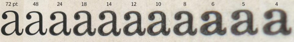
If you want to recreate this for the web, you’d need 11 different font files of the same typeface, each one representing a specific optical size. Oof. That’s a lot of files.
So, enter variable fonts. If a variable font has an opsz axis, it means its design will change depending on the size it’s used at. Just like that! The browser and the font work this out completely automatically.
How does this look in practice?
For both Aparey and Fraunces we created a specimen site that showcase the difference between text with and without optical size:
I found these differences quite dramatic when I first saw them, especially on the smaller text. YMMV on that, but hot dang — the text with optical sizing looks so much better!
Here’s a simple demo so you can look at how an individual letter changes. It’s using the Fraunces typeface. Edit the letter in the box to see how your favorite character changes its optical sizing!
See the Pen Optical sizing demo by PixelAmbacht (@RoelN) on CodePen.
The CSS you don’t need to write
The browser will apply the right optical size out of the box. If for some reason you want this turned off, you can use font-optical-sizing: none (auto is the default value). This will make all font sizes use the font’s default design.
If you want to control the optical size independent from the font size, you can set values for the opsz axis directly. Say a font has an optical size range from 16 to 64, you can set it to the maximum value like so: font-variation-settings: 'opsz' 64.
But unless you’re deliberately breaking typography and design rules, the font-size-to-optical-size thing the browser does should be your best option.
Go forth and picketh fonts with optical sizeths
A font with an optical size axis will make itself look better for the size it’s used at. It does so automatically, in collaboration with the browser or the operating system. You don’t have to do anything yourself — except use a font with an optical size axis!
Special megathanks to Luke Coe for letting me use his pixel mushroom. Go check out his other artwork!
In this Twitter thread I asked how to best explain what optical size is, and a lot of smart folks have given great examples. Check this out if you want to learn more.